
Brand Identity + Digital Design Sys.
Develop a calm, trustworthy wellness brand identity that feels grounded and nature-based, while still modern and professional. A wellness brand built around the idea of psychological enclosure and natural density. Exploring identity through the metaphor of a cultivated thicket.
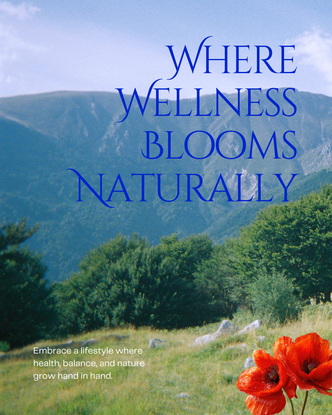
Restoration doesn’t always come from emptiness. It can come from being held, surrounded, and immersed.
The Brief
-Establish a feminine and natural identity for Boscage Wellness that reiterates their goals of clean beauty, environmental friendliness, suis-generis products and convenient shopping.
-Reflect the established identity update in the designs for a sale website that encourages return visitations and purchases.
-Avoid the “generic minimalist wellness template” look.
-Ensure reach to larger span of audience, including establishing a social media presence to communicate sale, new drops, etc.
-Ensure a strong retail presence including shelf space (packaging, sales ads, pop-ups, retail corners).
| Role: Graphic Designer / Brand Designer |
| Tools: Illustrator, Photoshop, Figma, InDesign |
| Deliverables: Logo, Brand system, Marketing assets (list here), Web Mockup |
| Industry: Wellness/ Health/ Lifestyle |
The Strategy
Boscage Wellness is a conceptual brand built around the idea of cultivated density—a departure from the sterile minimalism that dominates wellness branding. Instead of clarity through reduction, this system explores clarity through immersion, layering, and enclosure.
The name “Boscage” refers to a dense growth of trees or shrubs. That definition became the central tension of the project:
How can a brand feel restorative without feeling empty?
Wellness brands often rely on the same visual language—muted palettes, soft gradients, and excessive negative space. While calming, this approach has become interchangeable and lacks distinction.
- Create a wellness identity that feels distinct and memorable
- Avoid defaulting to minimal, “clean” aesthetics
- Build a system that can scale across packaging, digital, and campaign assets
Rather than positioning wellness as escape, Boscage frames it as entry into a dense, living environment—something closer to a thicket than a void.
Target Audience:
| Target Audience | Description |
| women 25–40, urban, high-stress, premium wellness buyers | People looking to easily incorporate wellness into their lives, those looking for affordable and sustainable products |
Goal:
Drive subscription-based product + Service Engagement
Key Constraints:
- Assets created for a 2-week launch window
- Designed for mobile-first consumption
- Optimized for scroll-stopping behavior
Competitor Differentiation:
Unlike other wellness brands that over extend themselves and burnout early, Boscage focuses on suis-generis products on rotation. Working with a combination of second-hand, antique, and small batch suppliers allows for quick inventory swaps and maintains a contemporary audience.
Key Brand Values:
Boscage values sustainable lifestyles while encouraging growth within its target audience. Looking to expand the quality of life for everyone that interacts with Boscage resources and products.
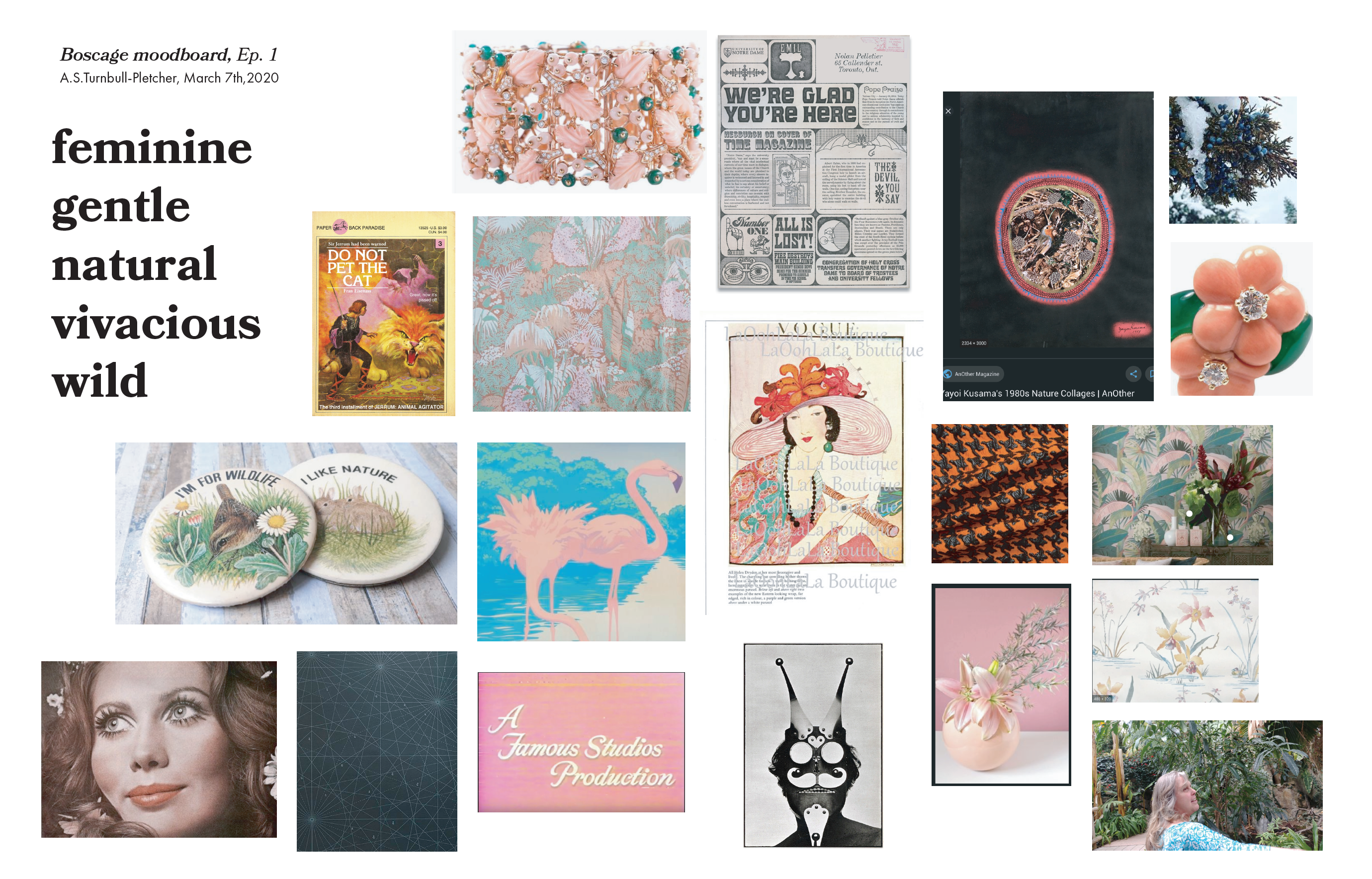
Moodboards + Inspiration
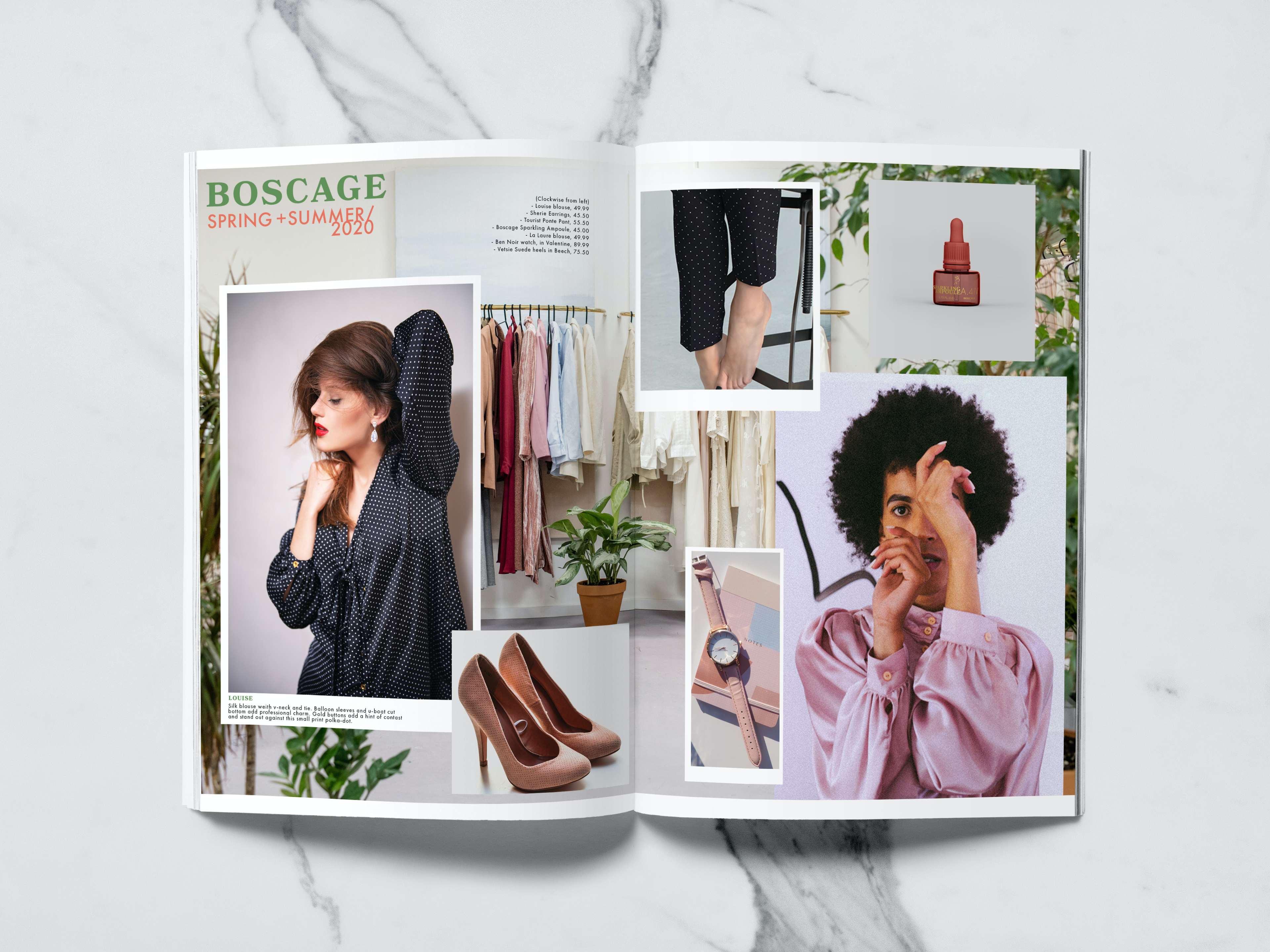
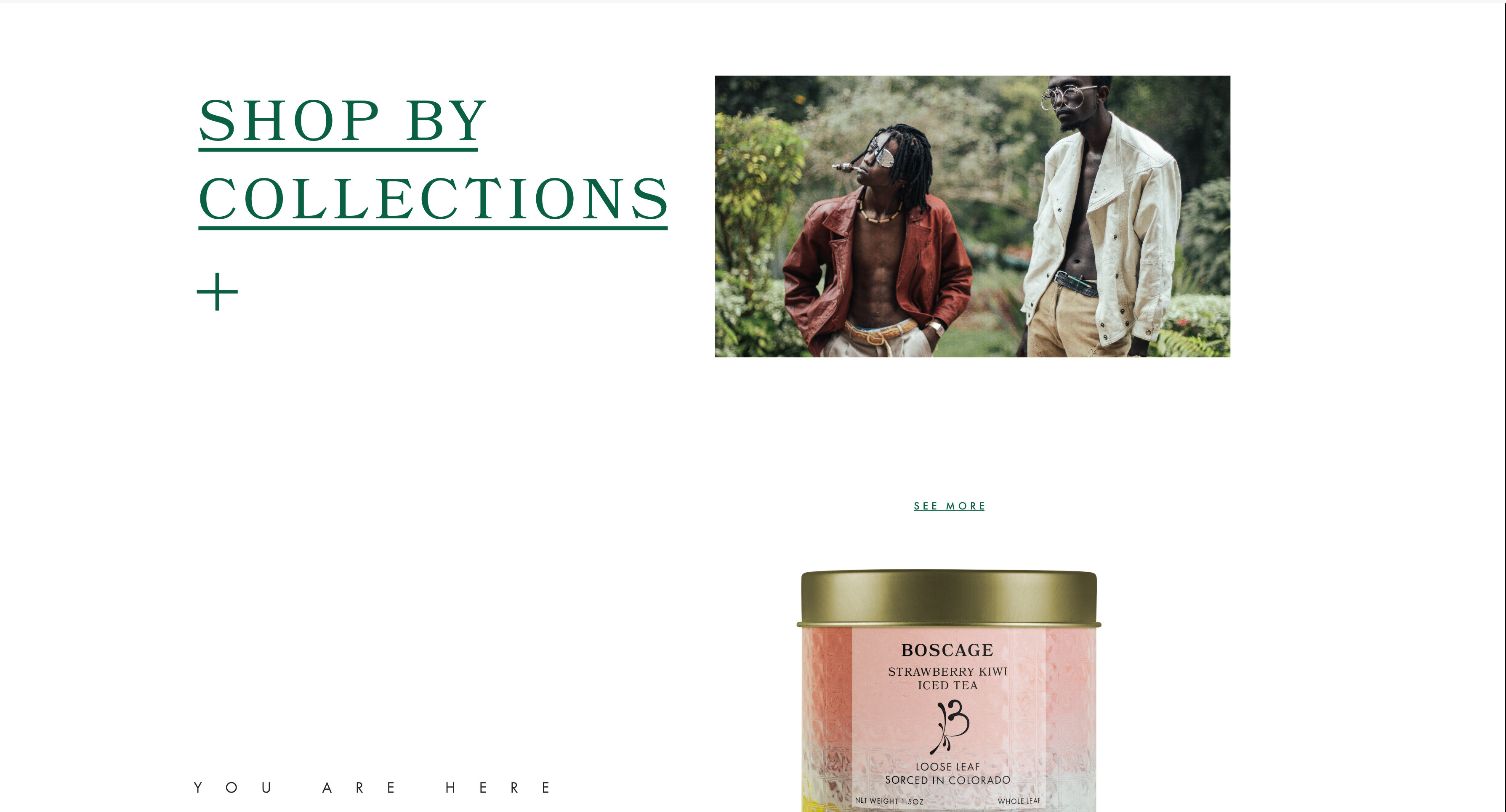
Boscage is a wellness lifestyle brand looking to provide a centralized digital space to access suis-generis products. Resilient, wild and free while having a feminine flair is the major inspiration for the brand.
Process
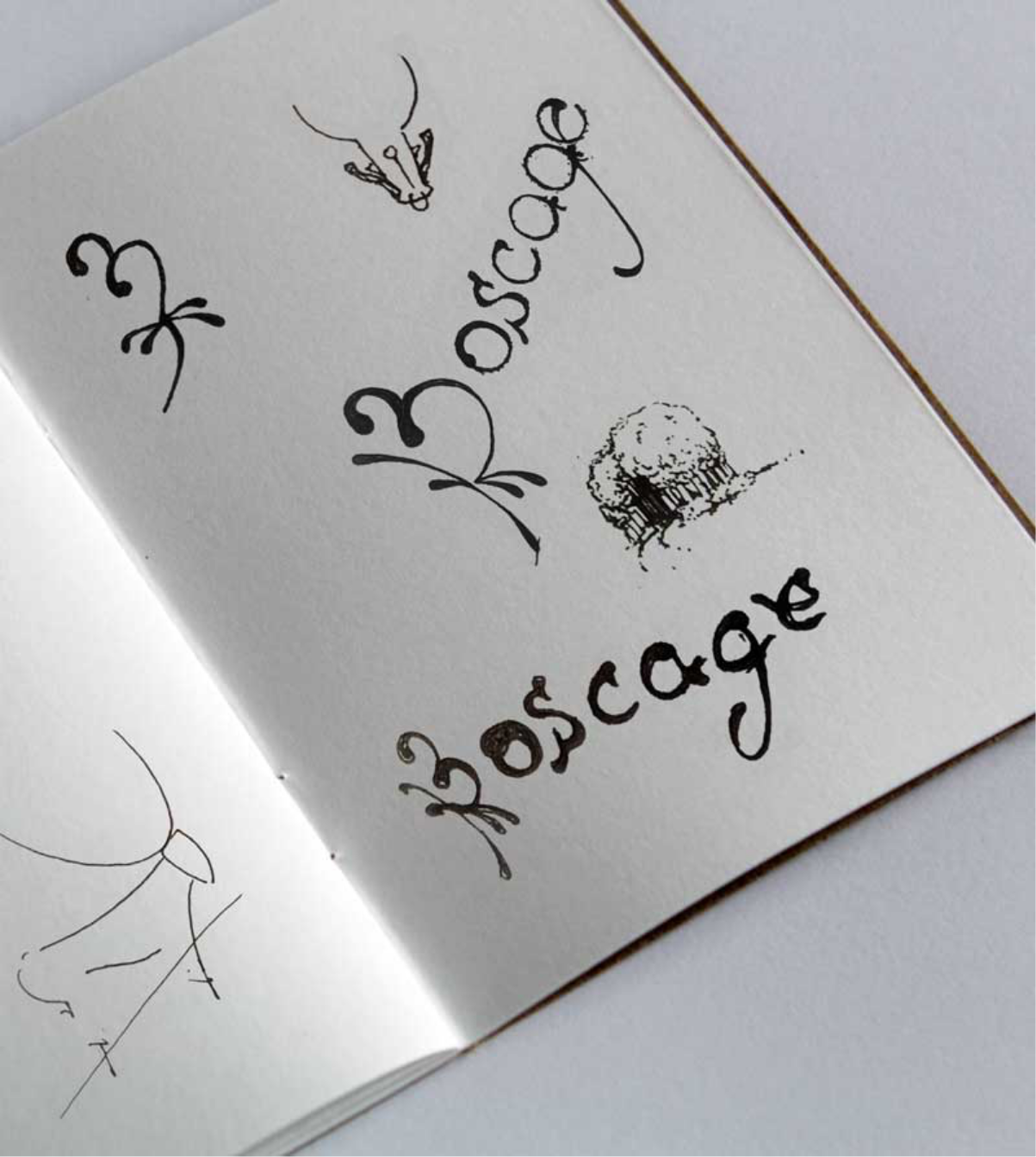
Sketches + Logo Exploration:
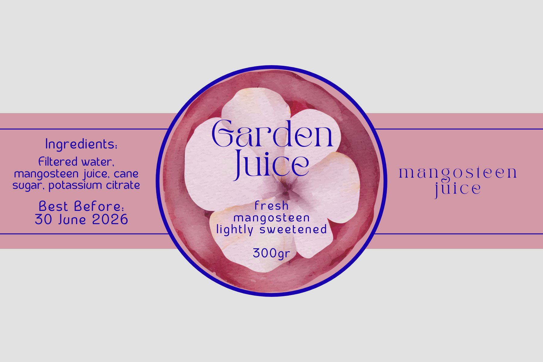
Initial logo ideas revolved around a more literal view of ‘boscage’ and focusing on underbrush. Moved more towards fluid organic shapes found on the side of antique crock pots. Often adorned with images referencing nature, like birds and flowers, numbers were also often etched into the side of the clay then filled in with cobalt.
Alt. Directions:

Final Decisions:
Visual System
Type Rules:
General rules are as follows: 40–70 characters for computers, 30–40 characters for phones. For website text, the optimal size is 16–20 px. This means that the approximate width of the text block should not exceed 760 px. Paragraph line height sizes are around 145–150%. One thought, one paragraph. Title size is font * 1.6. Body and lists typeface size should be 16px, headings 18px and titles 20px. Quoted text should be italicized and 18px.
Color Logic:
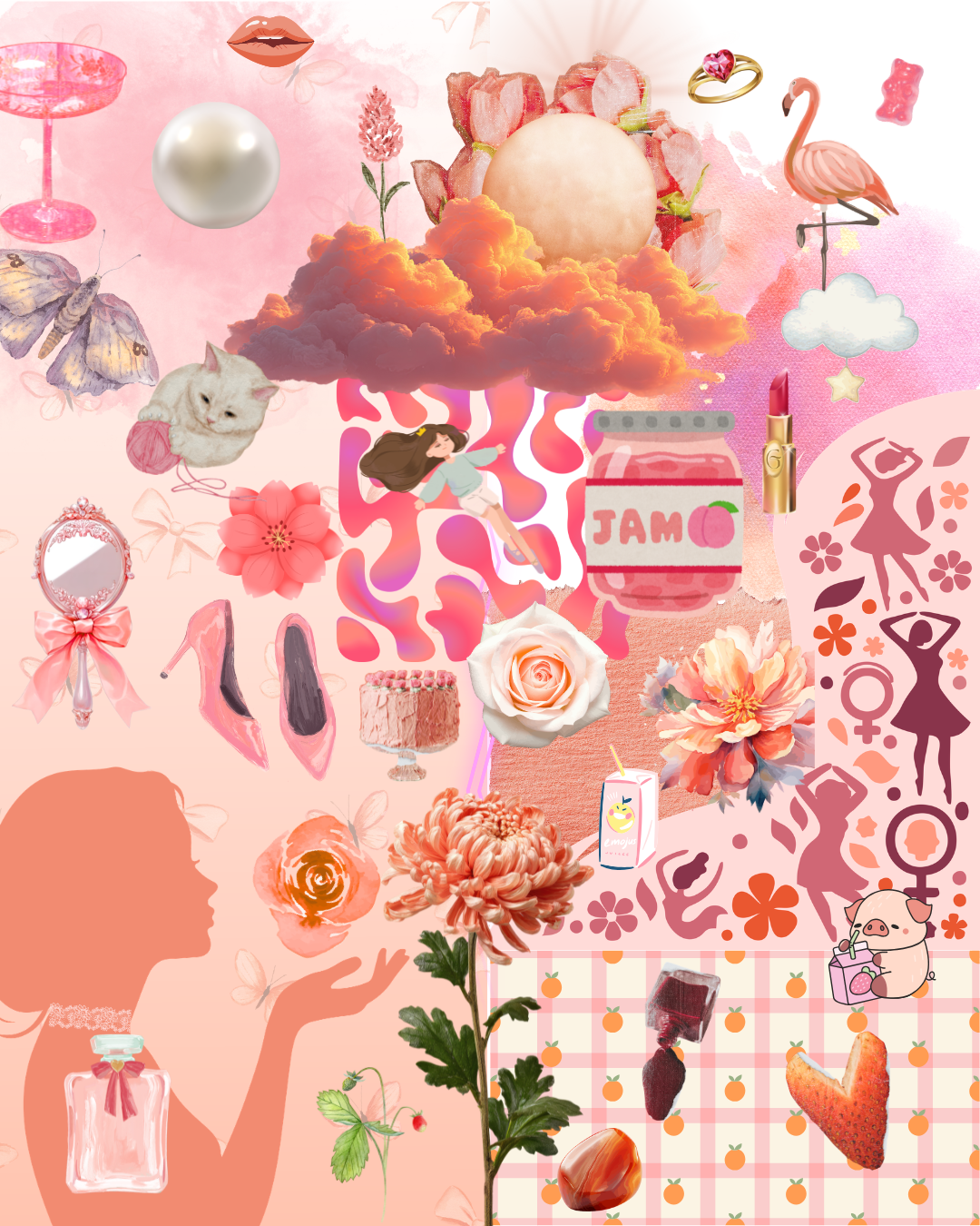
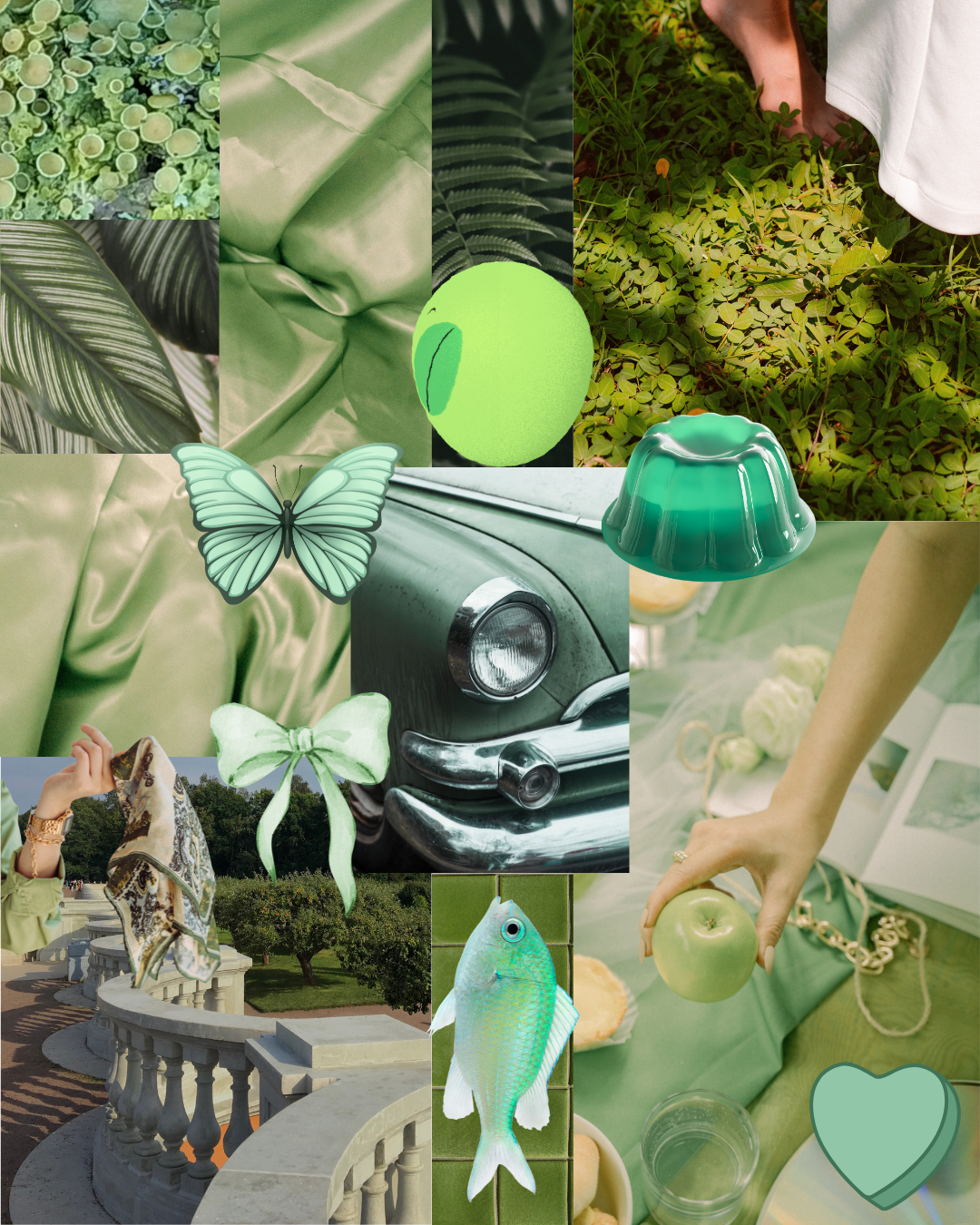
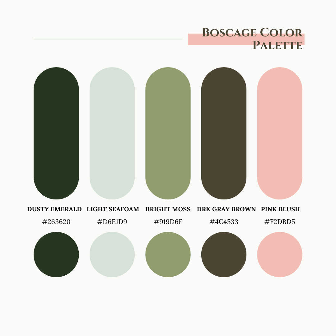
In contemporary context, pink is directly tied to femininity, while orange is associated with enthusiasm and creativity. Deciding upon a peach tone with pink hues felt soft while remaining energetic and effeminate. Green is a vivacious color that also represents nature and plants. A saturated mossy green and a deep muted emerald shade seemed appropriate to compliment the intensity of the peach. Whites and light, muted shades often invoke openness and a sense of calm. A light sea foam green was the final piece to create a dynamic, representative and cohesive thought process. Ultimately, a monochromatic base of one color paired with a high saturated complimentary color. Three or five colors to inform package direction and visual hierarchy.
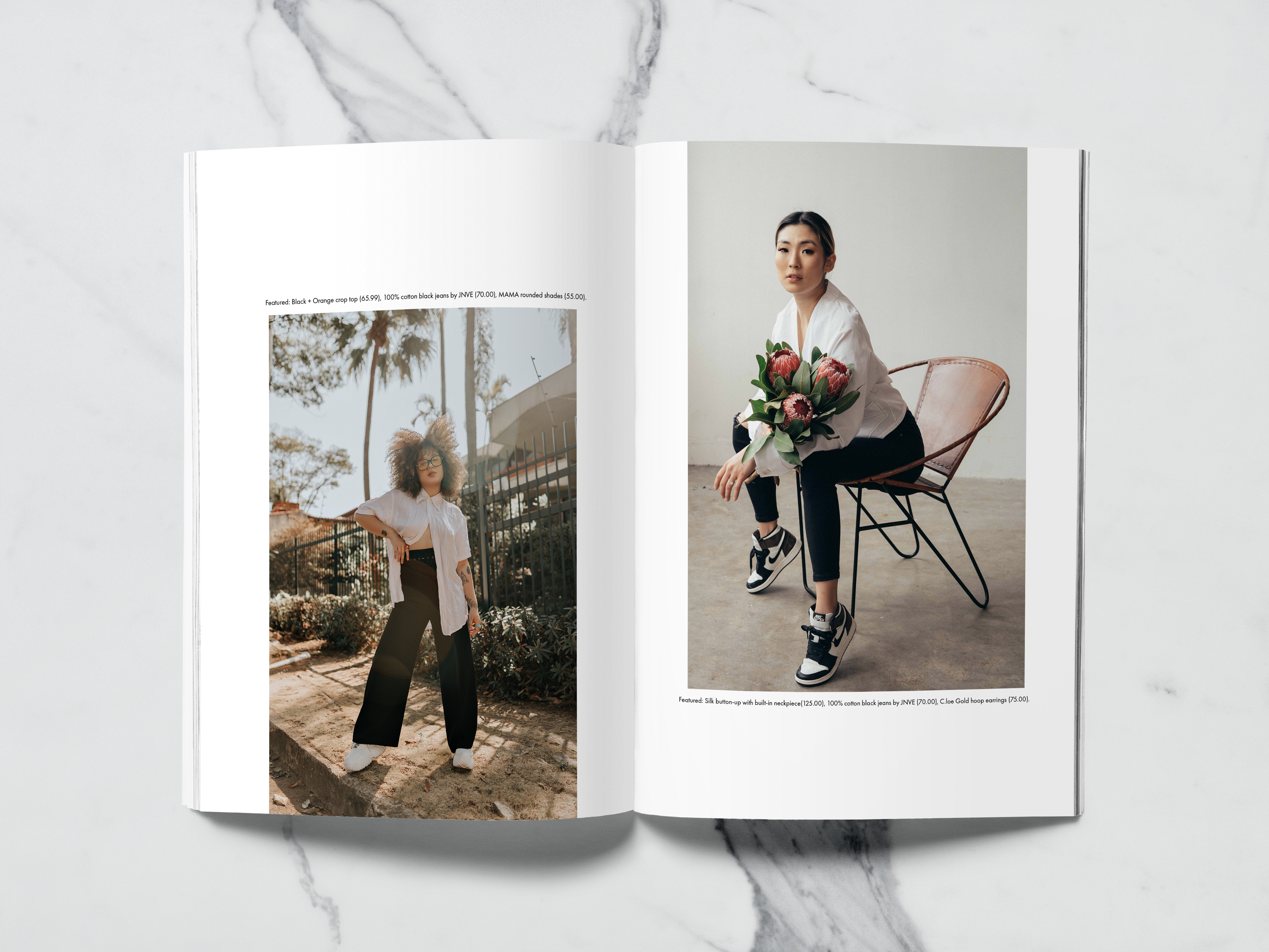
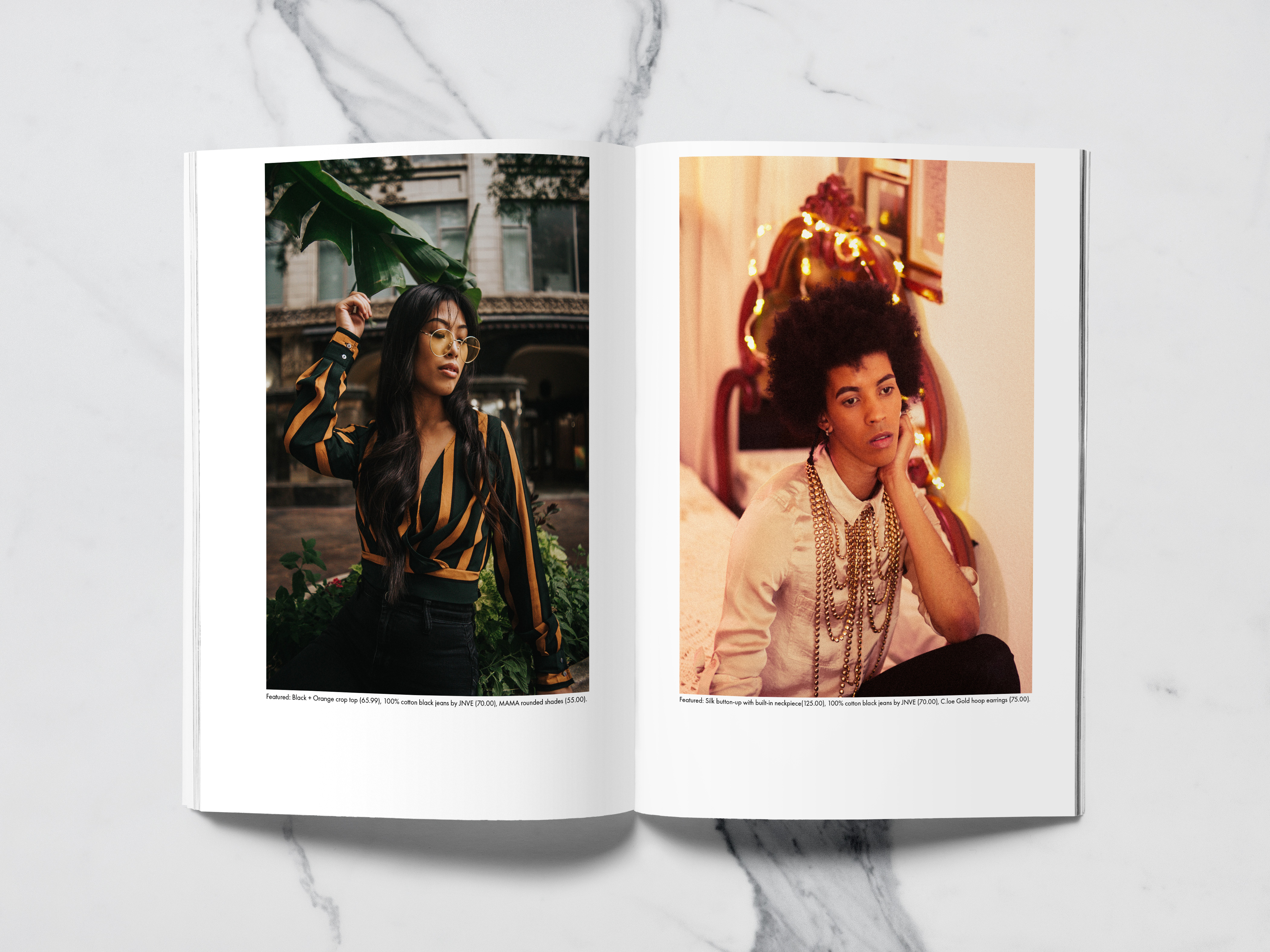
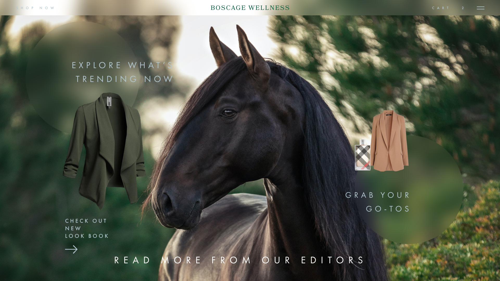
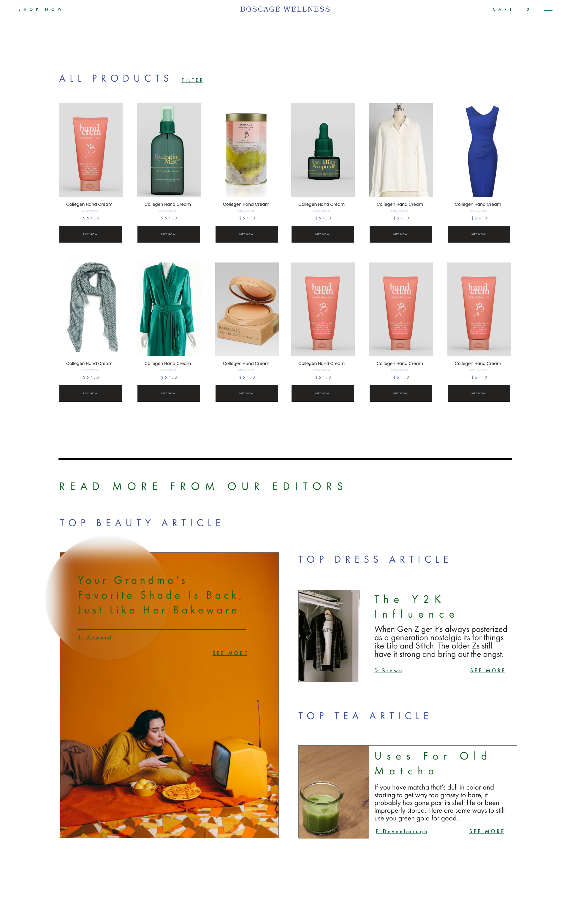
Layout Grid:
As someone deeply inspired by illuminated manuscripts, I initially thought to go in a more medieval direction. Once the scope expanded to include a website prototype, things shifted to a multi-column grid with eight even columns and a narrow margin between. Sales imagery, notices, articles, and signage take up at least two columns where product listings take up one column. Social media posts should lean towards manuscript layout.
Image Treatment:
Cross-processing, especially across website secondary imagery. Black and white image treatment for social media and print fashion imagery. Narrow portrait layouts dominate. Minimal white background or removed background for product thumbnail links.
Identity System
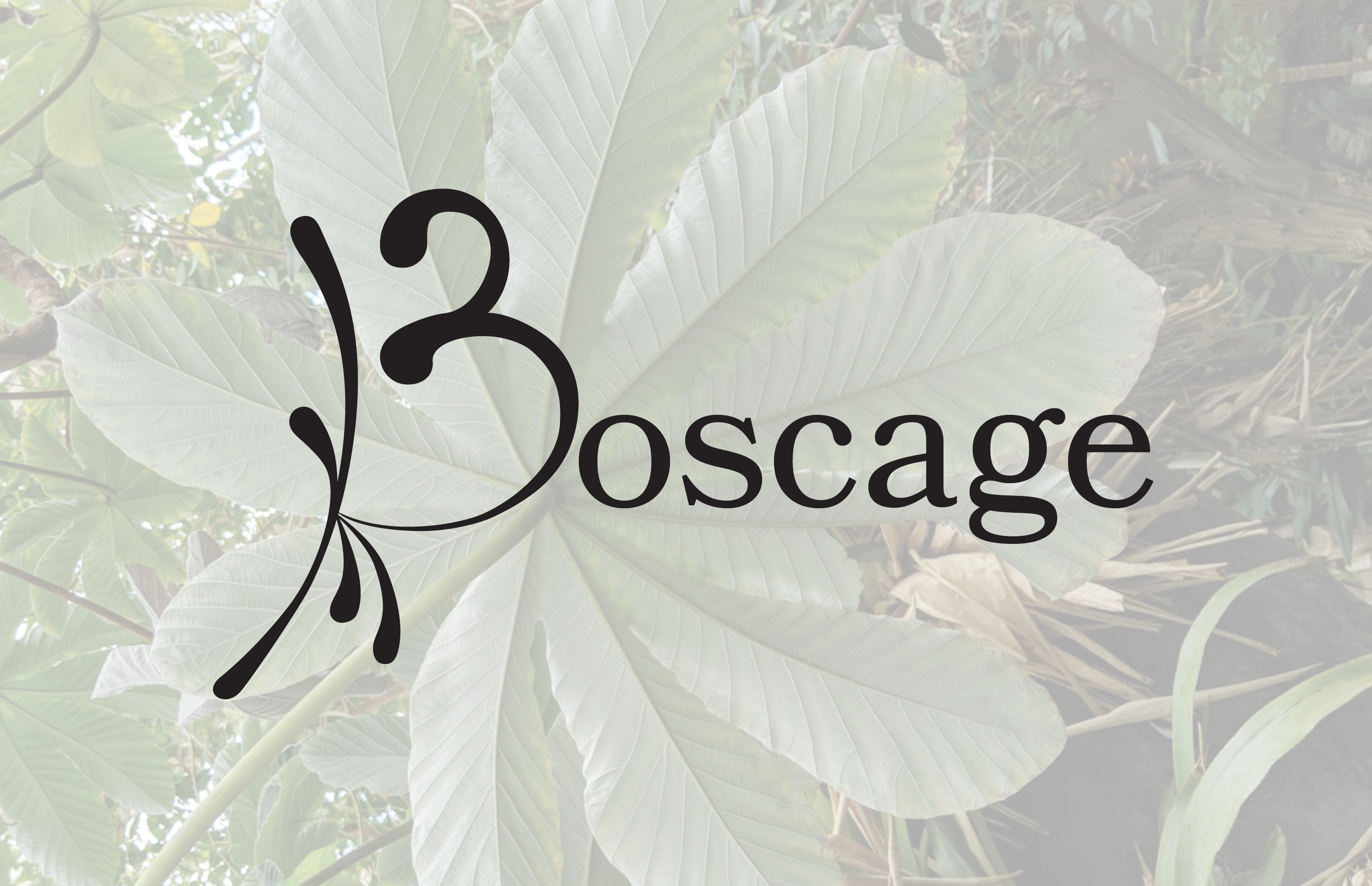
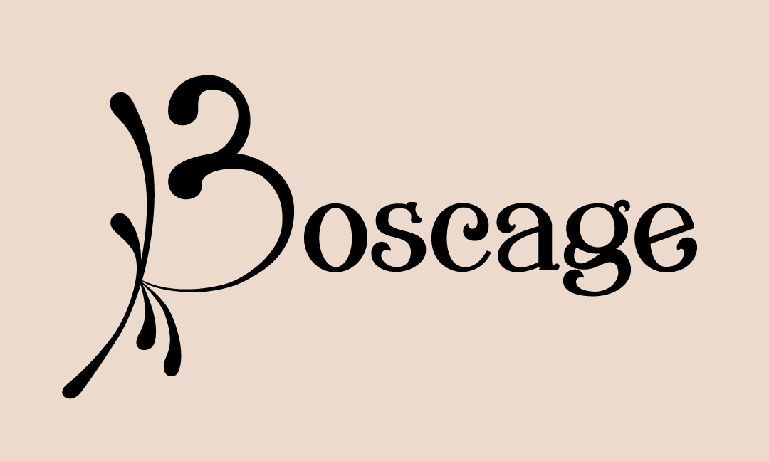
Logo:
Submark:
Icon/Wordmark:

Pattern System:
Typography + Color
Palette Swatches:
Type Hierarchy:
Collateral
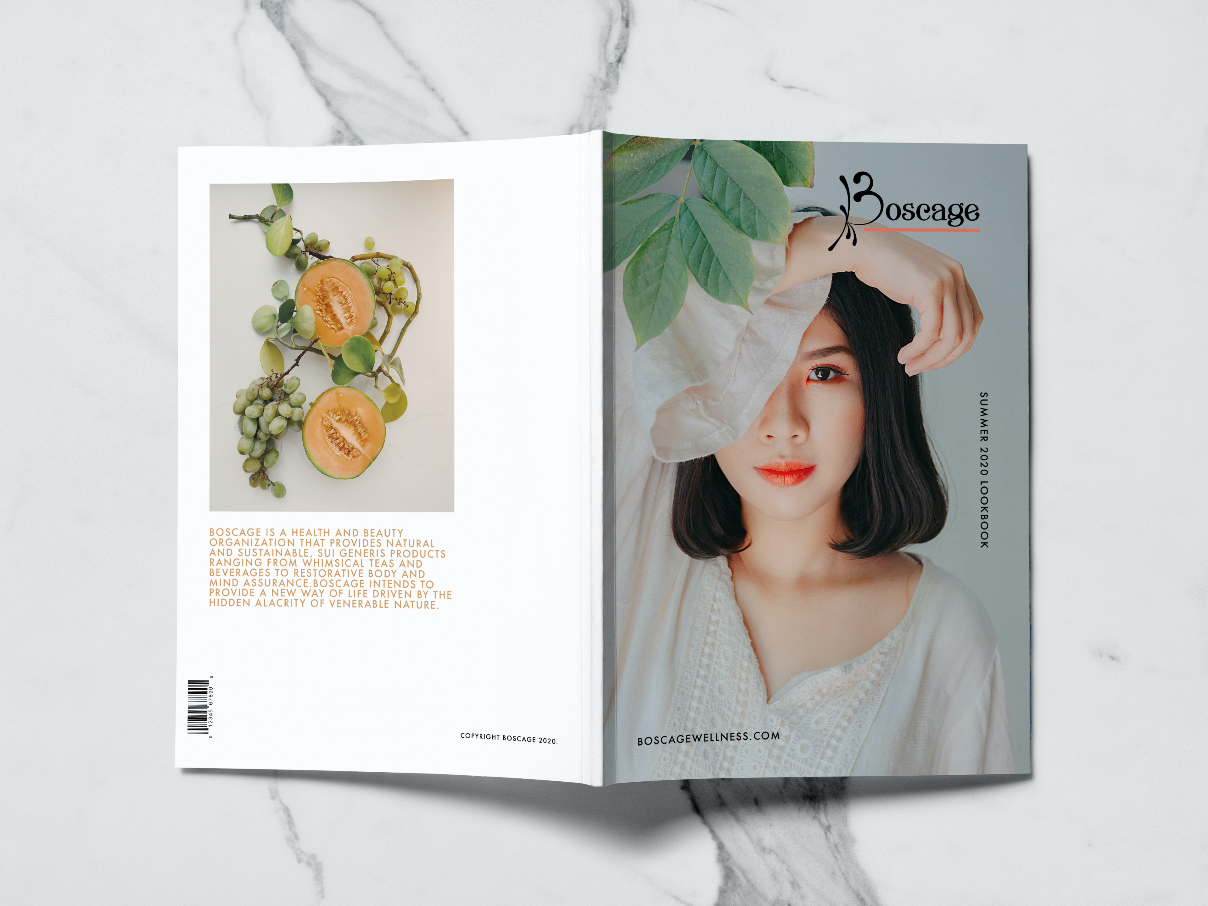
Highlight Catalogs:
Business Card:
Appointment Card:
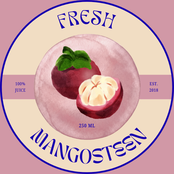
Wellness Product Label:
Email Header/Flow:
Landing Page:
Marketing System
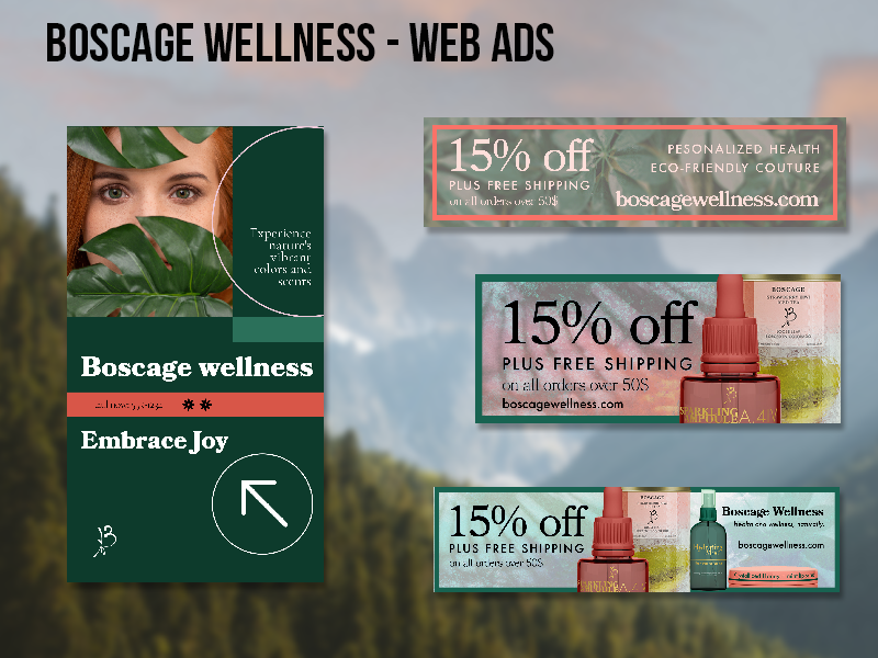
Paid Social Ads:
Instagram Post Template:
Story Template:
Ad Layout Variations:
Website/ UI Mockup
Outcome
Boscage Wellness demonstrates an alternative direction for the category—one that prioritizes identity over convention.
The project showcases:
- concept-driven design thinking
- scalable visual systems
- the ability to challenge category norms while maintaining cohesion
This project intentionally resists the default visual language of wellness branding. The result is a system that is more complex, more atmospheric, and more distinct—designed to hold attention rather than disappear into the background.
